Go into the data first
MMSI-Bench is a set of 1,000 multiple-choice questions where a model sees a few photos of the same scene and has to reason across them. Where is the window relative to where the first photo was taken? Which way did the camera turn? That kind of question, across 11 task categories from camera and object positions to motion and multi-step reasoning. Humans score 97% on it. The best model in the paper, GPT-5, reaches about 40%. GPT-6 Astra -a model particularly strong at spatial tasks- is not yet on the leaderboard. Still, it is an interesting challenge, to say the least.
Doing the task myself first
Before running anything, I took the question–answer pairs and solved around 10 questions myself (Admission: my initial goal was 30. After a few, I revised it to 15. After a few more, I settled on 10…). Spending a nice evening on this very fun activity obviously wasn’t about reporting a human baseline. It was just about understanding the tasks. What do I look at first? Where do I get stuck? Some questions took me seconds. Some had me going back and forth between two photos of a room, looking for the one object that shows up in both. It was also a useful reminder that, if I want to build a model that can do this with the right objective, architecture, and supervision, I first need to understand what the task actually is and how a human would solve it.
As the analysis will show later, motion questions with a moving camera were much easier for me. When you have two frames separated by only a small camera turn, you can often see the answer almost immediately.
Then going into the data
Then I asked a simple question: how different do the photos of a single question look from each other? I embedded every image with DINOv2, a purely unimodal visual encoder, and computed the cosine similarity between the views of each question. I picked DINOv2 deliberately: related DINO representations had also performed strongly in my master’s thesis for zero-shot building facade and roof classification.
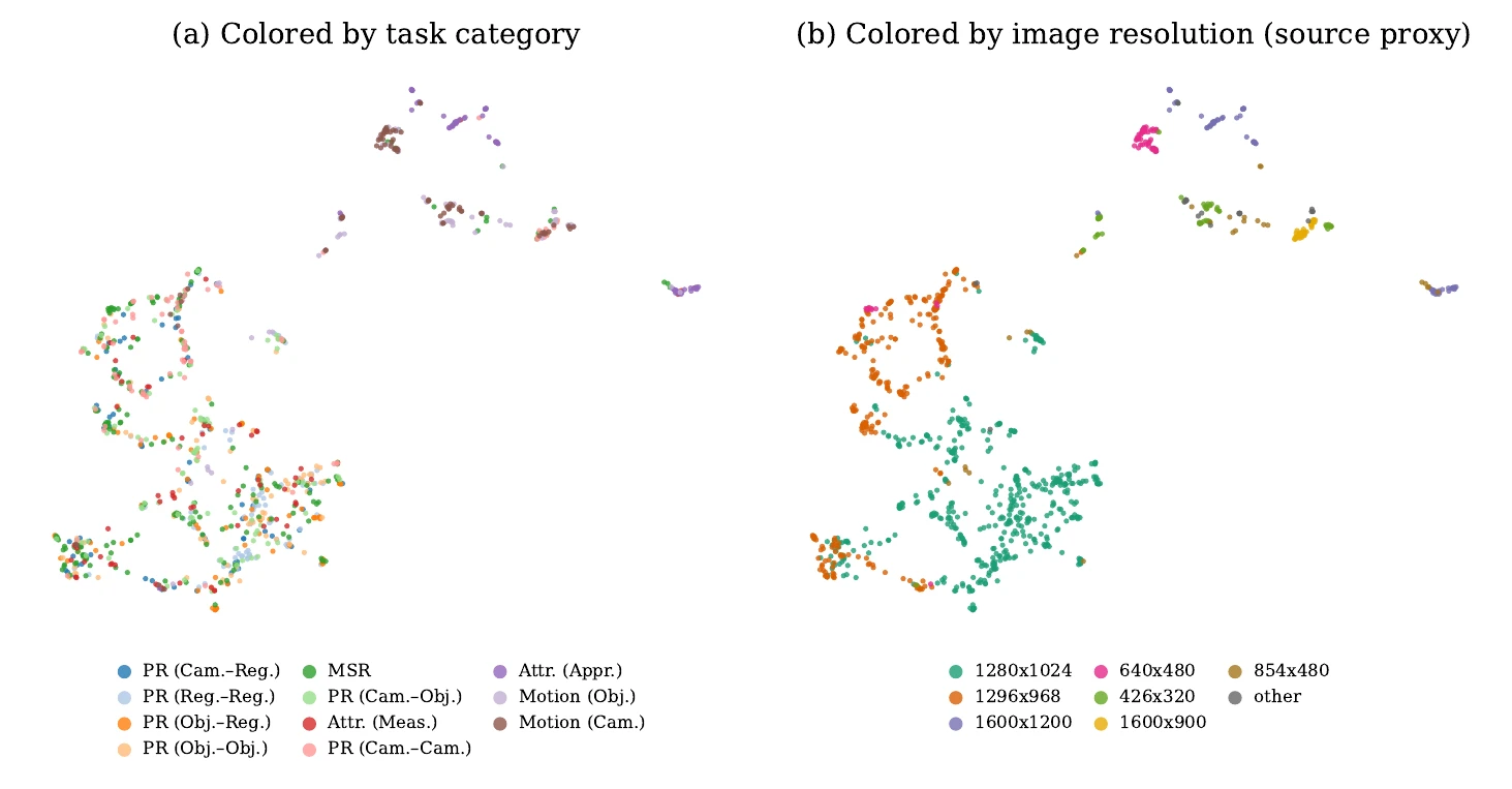
When I laid out all 2,550 images in a UMAP, they clustered by which dataset they came from (image resolution is a decent proxy), not by task category.
A few things that were -kinda- surprising and fun to discover:
- It is hugely 2-view dominant. 81% of the questions have exactly two images. 3 to 10 views is super rare, and almost only in the multi-step reasoning (MSR) tasks. Good thing to know before designing anything “multi-view.”
- The task categories look very different. The least similar photos are in the positional tasks involving regions, usually two photos of one room pointed at different walls. The most similar are in camera motion, mostly consecutive video frames. Human-labeling was much easier for motion questions for me too, so I kinda agree!
- But different does not mean hard. I checked whether easy ~ more similar and hard ~ more different. Apparently not exactly. Once you fix the task category, similarity tells you almost nothing about difficulty.
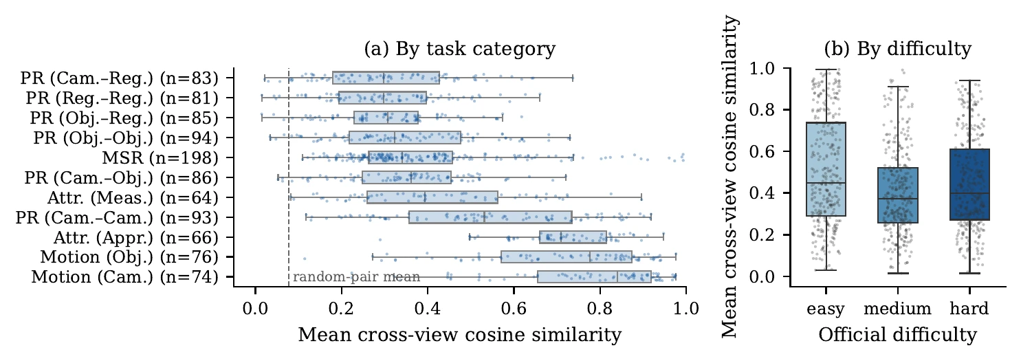
Left: mean cross-view similarity per question by task category. The dashed line is the average for two random images from different questions. You can see how different (thus hard?) the tasks at the top are, and how similar (thus easy?) the ones at the bottom are. Right: the same metric by the benchmark’s difficulty labels, which barely move, which falsifies what I just suggested with a question mark for the plot on the left.
My favorite example is two photos from the same living room with a similarity of 0.01, practically “unrelated” for the encoder! The only thing they share is a dartboard on the wall :) and you cannot answer the question without it (can you?).
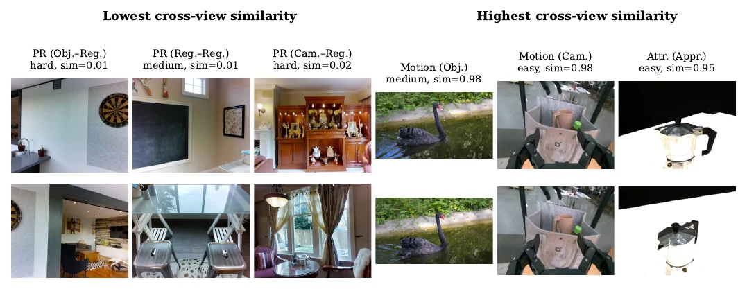
Each column represents one question-image pair. Left: the least similar pairs, dartboard first. Right: the most similar ones, where the answer hinges on a tiny change between frames.
So in some of the least-similar pairs, the thing you actually need to reason about is a tiny shared landmark that the global embedding effectively averages away. Ironically, the small clue most useful for solving the question can be almost invisible to a global similarity metric. That immediately raises another question: should a model explicitly learn to search for these small cross-view landmarks rather than relying mainly on global representations? I’m sure there is research on this that I simply don’t know yet. I’ll be looking for it.
The punchline that one can arrive with only a couple of plots and a few hours of work
I’m -in pain- realizing that I did this wrong in a couple of my past projects. I started with the model, the workflow architecture/schema, the training setup, and only looked at the data properly when something did not work -and sometimes never did!.
Especially in the age of AI, execution feels and arguably is easy. The scripts for this analysis ran on a typical consumer chip (M3) in minutes, and AI wrote most of them while I kept asking questions and analyzing outputs. I felt more like the advisor leading the project, and the AI more like a student, if I’m allowed to say that as a PhD student myself… I’m shamelessly admitting that it’s sometimes even better than a co-worker: when I asked whether difficulty tracks similarity, it went back to the paper’s appendix and pointed out that difficulty is itself defined by how long humans took to answer, and that each task category comes mostly from a few source datasets. Both changed how I read my own plot within seconds, without waiting for any natural or artificial bottleneck. It feels empowering and astonishing while leaving one with thousands of questions and a feeling that’s hard to describe -humility, awe, excitement, dissatisfaction and satisfaction, frustration and joy, all at once.
But I still tend to believe it worked better because we (you know, my virtual/proxy teammate) owned the questions and the judgement. We ‘co-worked’ and we produced. I didn’t refrain from going in, spending time understanding important code snippets, asking a bunch of questions, rarely asking for revisions and mostly trying to understand the underlying conclusions and clues that a given dataset or plot might offer. And I think I became a more useful person for my co-worker (or whatever we decide to call it) after I did the task myself.
Perhaps it’s a much broader question and I’m questioning how justified it is to end this small experiment with such a big conclusion but I guess that post and small exercise were just ‘that’ moment of realization that brought a bunch of past thought processes and experiences together into a single one. There’s more to learn, more to discover, and more to solve; and I am, we are still learning how to handle that while never ever stopping being a useful bottleneck. I might eventually have a separate subpage for this topic (edit: now I do), it lives here, but just spilling it here as a spoiler: I feel like my objective has recently shifted toward becoming a more useful bottleneck (but never giving up on being the bottleneck itself. Guess why? I think it’s useful to be an annoying bottleneck sometimes, think about your over-100-h-index-advisor (aka. an advisor with an h-index over 100) who questions every line of code, methodology, and design decision nd admit that this kind of behavior -though it can be annoying at first- is useful for pushing your research further. Or think about greatest geniuses, CEOs, or entrepreneurs, who were, or still are, doomed to be incredibly annoying and ended up making some of the the biggest impact of all…) while also not being a pure meat proxy.
More on that in the very next subpage.